
When I joined SPU (formerly SWU) almost five years ago, I was in seventh heaven. As the sole employee in my business, I wore many hats: photographer, accountant, marketer, secretary, etc. Unfortunately, at that time, marketing was my weakest area…until I found the ultimate marketing team when Sandy was touring in Chicago.
Within hours of returning home, I was organizing my marketing system with beautifully designed marketing pieces in which all I had to do was change a little wording and drop in some of my portraits.
However, over the past few years as I have grown as a photographer, my style and branding has changed. I found that some of the marketing pieces did not fit the images or brand that I have created.
Thankfully, the solution was easy. Since all of the marketing pieces are in Photoshop layers, I found that it was quite simple to change the look of a campaign.
Even if you are not a Photoshop guru, it is quite easy to work with the marketing templates from SPU. Here is what you need to be familiar with to make a few basic changes:
· Layers pallet
· Clipping Masks
· How to control opacity
· How to change the color of text
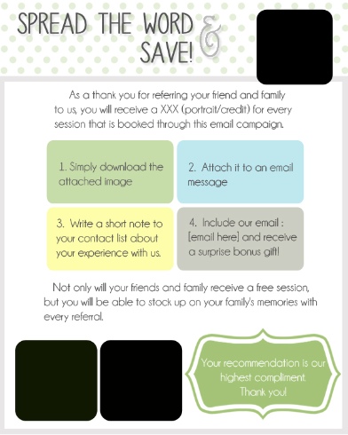
The Campaign
So let’s get to work! This month, we received the Studio Referral Email Campaign. I was quite excited to see this and can’t wait to implement this into my marketing. Here is how I am going to use this campaign. The day after a client picks up their order, I will email this along with their favorite image. This will just become a part of my workflow. However, since this is something new that I am implementing, I know that if I share this with some of my past clients, they will share this with their friends and family. So I will be taking some time to go email this to clients who have had sessions within the past few months or those who have been faithful clients for many years.
Images
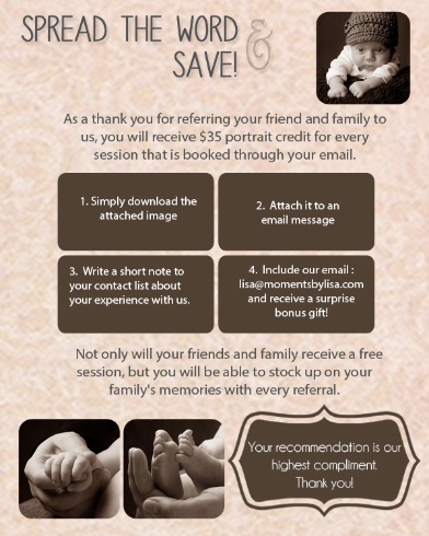
When working with the templates, the first thing I do is pick out the images that I want to use. For the referral campaign, I will use three images from the client’s session.
To place the images into the piece, go to your layers palette and locate the custom images folder.
Go to Image 1 and click on the “place image here” layer. Drag the image onto the template. Go back over to the layers and right click on the image. Click “create clipping mask”. The image is now placed and all you need to do is fit it into the frame. I am a PC person so I will hit Ctrl T to adjust the image.
Finish placing the images into the other two layers.
Graphics
The colors in this marketing piece are blue, green, and gray. These are not the colors that are associated with my business so we need to make a change.
In the layers pallet, open up the graphics folder. Doubleclick on the green thumbnail. This opens up and you are able to adjust the color. Click okay and move onto the next layer. Another way to do this is to open a marketing piece that you have already created. Instead of adjusting the color with the slider, you can just click on the color of the marketing piece and it will fill in for you.
The last thing I did while I was still in the graphics folder was to turn off the polka dot layer by clicking on the eye.
Text
After the graphics are filled with new colors, it’s time to move on the text. Go over to the layers pallet and click on the text folder. Work your way down each layer to modify the wording to your liking. Since I changed the color of the graphics, I also had to change the color of the text. The font was also changed.
Background
Finally, let’s work on the background. In my studio marketing pieces, I work with a background that has a little texture. So I opened up a layered marketing piece that included the texture.
I went to the Background folder and clicked on the layer that said text background. I then went to the other marketing piece and drug that background layer onto the email campaign. Now, since there is texture, I did not want the full color to take away from the wording and portraits. So I went up to the opacity and lowered it to 35%.
Finally, I turned off the text background layer.
I now have a marketing template that I can use over and over again. In the future, all I need to do is drop in client images and send it along.
Just because we are working with templates doesn’t mean that our creativity is limited. Experimenting with different fonts, colors and blending modes is a lot of fun and will help make your marketing pieces stand out!
Yours,